Showing posts with label burndown chart. Show all posts

Friday, September 17, 2010

Color-coding your scrum board

At my company we've been using Scrum for a few years now. And even though I'm quite sure we're not living up to Schwaber's and Sutherland's standards, we seem to have found a way to make the process work for us across many projects.

Like many companies we started out with a simple physical scrum wall:


Later we started putting the burndowns on our intranet, so that everyone could see them. And we started using colored post-its for indicating different types of work.

In our case we use yellow for development tasks, pink for non-development tasks (i.e. testing and documentation) and orange for defects. There's no specific reason for using these colors. They just happened to be the post-it colors we had available when we started using colors. Since then my mind got used to them and I haven't yet heard a reason to switch. Although some of our tech writers are frowning at being "the guys who do the pink work".


As we've been growing our use of Scrum, we've also been using more and more tools. First was the online burndown charts. And then we started using a virtual scrum wall, so that we could share the same wall between distributed teams. It was a great boost for our distributed development, although most team members still sometimes long back for the days when they had a physical wall. Nothing beats the satisfaction you get from moving a physical post-it across 5 inches of whiteboard space.

We've been using Scrum for Team System for a while now to keep track of our stories and tasks. And I thought we were quite happy with it. Sure, we lost the ability to color code our task types. But the task board we used has nice colors too, although it uses them to code the columns. So "done" is green, etc.

But recently I noticed that it was difficult to quickly understand the status of a sprint from simply looking at their board:


So is the status of this project? It's hard to say without looking at the details of each task. It could be that everything is going fine, it could be that things are horribly wrong. There is no way to tell which one it is, unless you get closer to the board and read.

So over the weekend I re-encoded one of our boards with the colors we used back in our "physical days". Now look at the same board where we've used colored post-its:


Yellow = development tasks, pink = non-development tasks, orange = bugs

When we applied this color coding to our existing scrum board, I was shocked at the amount of insight it could add.

So I wrote a quick tool to generate these color-coded task boards for us. The process is purely automatic: read the data from team system, apply a few simple rules (e.g. anything with the word "bug", "defect" or "issue" in it, must be a defect) and output a HTML version of the data. But even with such a simple system we've been able to more easily get a feeling of where all projects stand by simply glancing at the board.

So what is your experience with scrum walls? Do you have any tricks you use to help visualize the data?

Saturday, August 25, 2007

Online burndown chart generator

One of the aspects of Scrum is its focus on transparency - getting all information out in the open. And one of the areas that enables the transparency is the burndown chart. It's a public posting of the progress of the team throughout its current sprint.

On the horizontal axis you see the days of this sprint. The vertical axis describes the amount of work. At the top of the vertical axis is the number of "ideal man hours" we committed to for this sprint. The straight diagonal line is the "ideal burndown" that we're aiming for. The slightly less straight line is our actual burndown. As you can see this chart is from somewhere during the third week of our four-week sprint and we're slightly above target. But things don't look as desperate as a few days before, thanks to some colleagues getting back from Holidays (which it says in the small scribling that you probably can't read).

As a Scrum master I like to post this information as publicly as I can. So just having it on the wall of our team room isn't good enough, since there are many people that don't visit our team room. Ideally I'd like to have the burndown chart projected on a wall in the central hallway of our office, so everyone can see it first thing they come in in the morning. But as a nice step along the way to this, I chose to publish the chart (and the rest of our product backlog) on our project wiki.

In the first sprints I did this by taking a photograph of the burndown chart every morning, right after updating it. I'd then upload the photo to our wiki. The only problem is... uploading them every day turned out to be too much of a hassle. So the wiki actually only got updated once a week. And that's not good for transparency of course.

So this time around we went searching for a simple tool that would lower the threshold of updating the burndown chart on our wiki. We searched for an extension to MediaWiki that allows you to create a chart by just entering the numbers in your wiki text. That turned out to be quite a challenge. There are many charting and drawing extensions for MediaWiki, but they either didn't do what I wanted or we couldn't get them to work on our wiki.

In the end I just gave up and wrote a simple web page that -when fed with the right parameters- will return a PNG image of the burndown chart. You call the page like this:

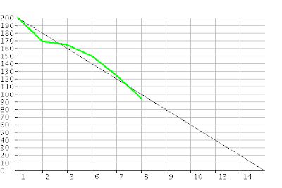
  • burndown.jsp?days=1,2,3,6,7,8,9,10,13,14&work=200,170,165,150,125,95
And the page will return the following image:
So the days parameter indicates the day numbers shown on the bottom. I entered all of them for the entire sprint right away. The work parameter is the work remaining. I just entered the values that I know, which is why the green line stops halfway through.

The generated chart is really simple and not very pretty. But it is very easy to keep up to date and that's what counts most. I just add the remaining hours at the end of the URL every morning... and that's it.

Although I consider this generator a stop gap solution until I find something better, I imagine it might also be useful to other budding Scrum masters. For that reason I've put the page online for public use at http://apps.vanpuffelen.net/charts/burndown.jsp. Just click the link and you'll get some usage examples.

Let me know if this generator is useful to you in the comments section. Also let me know if there's something wrong with it and I'll do my best to fix it.

Update (January 1st, 2010): in my company we've created a custom version of this same tool and used that in many projects over the last few years. This public burndown generator has drawn over 60.000 charts in 2009 alone, so apparently we're not the only ones who use burndown charts. That's why I've now updated the tool with the best features that we've added over time at my company. Check the latest version on http://apps.vanpuffelen.net/charts/burndown.jsp for all the features and let me know what you think of them.